The Do’s & Do’s of Gallery Walls

0 comments

Nope, you didn’t read that wrong. I did mean to say “do’s and do’s”. After I posted my blog post on Monday about gallery walls I got so many emails with questions about them. Most were asking if there are any rules to creating a gallery wall. I’m here to gladly say that there really are no rules to gallery walls. The only “don’t” that I can think of is “don’t” be afraid to experiment and think outside the box.

Gallery walls tend to be very scary to the general public because there are no true guidelines to them. I’m hoping that for those of you who are intimidated by them, this post will help you out a little.

Do #1: Mix and Match Frame Styles

Don’t feel confined to using one style of frame. You can pretty much use any style and size you want. This is the perfect time to mix traditional with modern, square with round and framed with unframed. 

[image via Decorator Dozen]

Do #2: Feel Free to Use the Same Frame Color

To give your gallery wall a more crisp look you can use the same color frames. When using the same color you can do two different arrangements…1.) All the same shape in a more structured pattern, or 2.) Different shapes in a more loose and scattered pattern. 

Pinned Image

[image via Elements of Style]

Pinned Image

[image – yhl]

Do #3: The More the Merrier

When doing a gallery wall make sure you go all out. Don’t just stop at 3 pieces. Go big! Feel free to fill up an entire wall. It will make for a truly interesting conversation piece in your home. Don’t feel like you have to achieve this overnight though. You can start small, and then add on as you collect new pieces.

Pinned Image

[image via Elements of Style]

gallerywallisuwannee

[image via I Suwannee]

Pinned Image

[image via Kentucky Mama]

Do #4: Mix and Match Art Styles

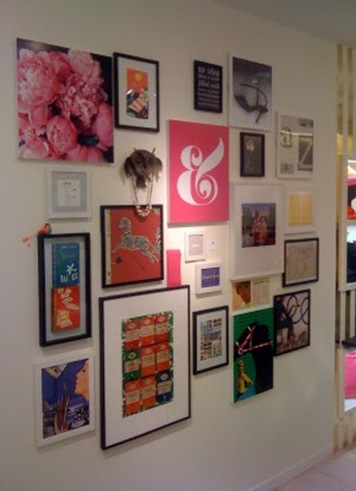
Combine abstract art and still lifes, portraits and line drawings, watercolors and Crayola masterpieces(…from the kiddos). They will all become one big happy family once they are hung together.

Pinned Image

[image]

Pinned Image

[image – kate spade]

Pinned Image

[image via Rusty Hinges]

Do #5: Have Fun! 

Gallery walls are the perfect way to tell a story about your life as well as let your personal style shine through. So, have fun with it. If the spacing between each piece isn’t exactly the same don’t sweat it. Add some quirky pieces in just for the fun of it.

Pinned Image

[image – kate spade]

Designer Tips…

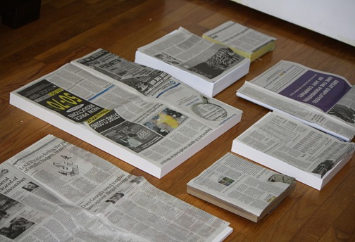
Here’s a great tip for creating your gallery wall. Arrange all of your artwork out on the floor prior to hanging. By arranging your artwork on the floor you can see how it all works together, and you can move pieces around to create that perfect arrangement.  It’s much easier than hanging the art on the wall and having to patch a lot of holes when you need to change the arrangement. 

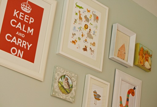
Another tip that I got from John and Sherry is hanging newspaper on the wall in the shape of the artwork first to make sure you hang the arrangement in the correct location.  I used this technique when I hung the gallery wall in my son’s room and it worked wonderfully.

IMG_1971

IMG_1981

Chase Nursery 6

Happy Hanging!

4 Months

0 comments

It’s hard to believe that today my favorite little man is 4 months old.  My how time flies and my heart grows.  Every day I fall deeper in love… 

**Photos by Angela Wilson Photography.

Gallery Walls

0 comments

I’m a sucker for a good gallery wall.  I was doing some clean up in my inspiration files and kept coming across pictures of them. 

hanging-art-may-2006-domino

[Domino]

KateSpade-viadelightbydesignblog1

[Kate Spade]

1600 Fam 17

[Caitlin Creer]

IMG_4318

[Design Indulgence]

latimer8

[unknown]

yhl hallway-progress2

[Young House Love]

[Pinterest]

VINTAGE-MODERN_CHIC_INTERIOR-DESIGN_BELLE-MAISON-BLOG_8

[Canadian House & Home]

Caitlin-Wilson-Design-Style-Files-chevron-gallery-wall

[CWD]

wed-white3

[Lonny]

**If any of you know where the [unknown] images are from please comment so that I can give credit.  I didn’t do a great job of saving the source on these images.

Some people are intimidated by a gallery wall because of the loose form.  While I was doing a quick search on Pinterest, I found this hanging guide.  It gives some examples for creating a gallery wall of your own.  This is such a great starting point for creating your own gallery wall if you aren’t quite sure how. 

229341284_DO5bxA63_c

The Perfect Settee

0 comments

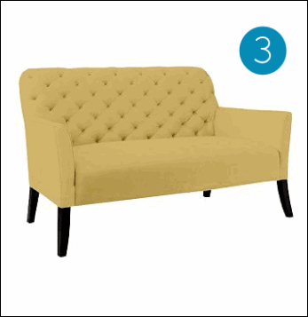
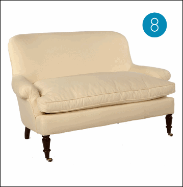
I’ve been thinking about getting a settee for my family room.  I have a spot that needs some kind of seating and I think a settee will be perfect.  Here are the ones I’ve come across in my search…I’m still on the lookout for that perfect one.

1

jcp

west-elm

hsn

[No. 4 is probably my fave at the moment]

cb

jayson

lee

wisteria

BALLARD

1,2,3,4,5,6,7,8,9

LiveJournal Tags:

Fall Wardrobe Round-up

0 comments

This fall you’ll be seeing me in…

fall fashion1 copy

fall fashion 2

fall fashion 3

fall fashion 4

fall fashion 5

[all images via Pinterest]

What’s your fave Fall fashion trend?

LiveJournal Tags: ,

Fave New Product

0 comments

I have a new favorite product.  I just saw it over at Lindsey’s blog.  She just bought a few and is in the process of spray painting them.  What is it you ask?  It’s graphic overlays that you can use on just about anything…walls, furniture, you name it.  The company is very simply called O’verlays

image

Their overlays come in a variety of sizes as well as custom sizes.  Here are some examples of what customers have done with them.

Ikea furniture and Overlays make the perfect pairing because neither costs very much but together they look like a million bucks.

Just imagine how chic the Rast chest of drawers could look…

rast copy

I’m thinking of doing that combo myself.  I need another piece of furniture in my family room and that would be the perfect piece.  Not to mention it would give me some much-needed storage.

What DIY project would you create with your favorite O’verlay?

LiveJournal Tags: ,,,

Touch of Charm–home Office

0 comments

With this pillow as inspiration…

VIVACIOUS-PILLOW-PINK_300

I created this design for my latest Touch of Charm client. 

angie r room copy

My client wanted a warm, cozy and fun design for her office.  She sent me the bright Trina Turk pillow along with some others as her inspiration.  I was really drawn to the whimsical design and fun colors in the pillow, so I based my design for the office off of it. 

I enjoy doing these virtual designs for clients so much.  The only downfall is that I don’t get to see the finished project soon enough.  Can’t wait for this one to be completed!

**If you are interested in rates for my virtual design service please inquire by sending me and email at charmhomedesign@gmail.com.