I finally got a chance to take a photo of my family room. There are still so many things that I want to do in here but at least it is presentable.
Exciting News !
at 04.49 0 comments
I know it’s been a little quiet on the blog lately. As if I didn’t have enough going on already with trying to get ready for Chase and wrapping up client jobs, now we’ve added a whole other element to the mix. WE BOUGHT A HOUSE!!!!!! I’m thrilled and stressed to the max at the same time. Billy and I knew that our condo was going to be too tiny for a family of 3 and a half(our dog Sweetie being the half), but we were trying to make do. Then, about 2 weeks ago, we found an amazing deal on a little 50’s ranch-style home and we jumped on it.
What does this mean??? Well, it means that we’ll be moving into a new house while I’m almost 8 months pregnant. [I know, I know…I’ve totally lost my marbles] It also means that you’ll have to wait a little while longer to see pics of Chase’s room since it will be moving along with us. We are hoping and praying that Chase will be patient and won’t try to come early. We don’t really have a Plan B if that were to happen.
We have our work cut out for us with the new house. Right now it’s a total mess from the renter that is living there. Once they move out and we get it painted, I’ll take some pictures to share with you. I’m really excited about sharing the renovation process on the blog, but it will be very slow going. I doubt I’ll have much time for renovation work while taking care of a newborn.
latest project
at 04.48 0 comments
i gave you all a sneak peek of my latest project on monday, and i finally have the rest of the pictures edited.
i was so excited to finish this home. it was a 4000 square foot model home in houston, texas and was so much fun to work on. i’m going to go into more detail about my inspiration and give away some of my shopping secrets next week. i’m also going to talk about some of the photo do’s and don'ts that i figured out since this was my first real photo shoot {on my own at least}.
until then have a great weekend!
Adore Home Magazine
at 04.10 0 comments
So, if you haven’t seen Adore Home Magazine, the new Australian online publication, then you are seriously missing out. This new publication is packed full of design inspiration and beautiful images.
Since the seasons in Australia are opposite from ours, Adore Home has their summer issue out now. It’s the perfect thing to read while snowed in for the day. In case you haven’t heard, Atlanta got shut down by a snowstorm last night. As I type I have 6” on my deck. I know, I know 6” isn’t much for someone who lives in say NY but we don’t have snow shovels and plows to clear anything away…plus we are getting ice too.
Interview at Pretty Haus
at 04.09 0 comments
Today I’m being interviewed by Anne over at the Pretty Haus blog. Anne had some fun and interesting questions for me. If you are interested in finding out what room I would be or what my must have tool as a designer is…
then head on over and check it out. Click Here to go to the interview.
LiveJournal Tags: interview,pretty haus blog
Design Open House at the High
at 04.04 0 comments
If you aren’t busy on July 28th you should spend an evening in design at Atlanta’s High Museum of Art. Cocktails will be served between 5:30pm and 6:30pm. Then you can view Modern by Design starting at 6:30pm. Please RSVP to jennifer.bahus@woodruffcenter.org or 404-733-4562.
LiveJournal Tags: High Museum of Art,Atlanta,Modern by Design
Graffiti AND aNTIQUES
at 04.03 0 comments
The day is finally here for our Windows on Design 2011 window display to be revealed. The theme for the Design Collective ATL event this year is “Celebrating Atlanta”. Each designer had to come up with their own design based around our lovely city. Taylor and I had a brainstorming session to come up with our design a few months ago. We were so excited when we came up with a graffiti theme. We felt like it totally embodied Atlanta’s urban market. We were even more excited when we were paired with Regalo Antiques and they were totally on board with a it. We had such a fun time coming up with the design and marrying the beautiful antiques from Regalo with very urban graffiti art.
The only thing we needed once we were finished with our plans was a great graffiti artist. Man, did we ever find one! Greg Moncrief and his wife April from John G Moncrief & Associates created the most amazing graffiti artwork as the backdrop for our two window scenes.

The only thing we needed once we were finished with our plans was a great graffiti artist. Man, did we ever find one! Greg Moncrief and his wife April from John G Moncrief & Associates created the most amazing graffiti artwork as the backdrop for our two window scenes.

[Greg in front of his art. These pieces are being sold for $2100/pc]
Kid’s ARt Idea
at 03.46 0 commentsHigh Style High Rise
at 03.45 0 comments
It’s not very often that you can see the designs of six major Atlanta designers all in one building, but Atlanta Homes & Lifestyles is making this possible. AH&L is sponsoring High Style High Rise, a tour of six superbly designed homes at The Residences at W Atlanta – Downtown, which benefits the High Museum of Art running from March 8th through April 1st. Each featured designer is paired with a local retailer. The pairings include Michel Boyd for Bradley Hughes, Amy D. Morris for The Mercantile, Bill Peace for Mitchell Gold + Bob Williams, Barbara Westbrook for Room & Board, Kerry Howard for Redefined Home Boutique and Susan Ferrier for R Hughes Showroom.
See and hear Barbara Westbrook, one of the designers, in the video below as she talks about how she gets started with designing a space.
See and hear Barbara Westbrook, one of the designers, in the video below as she talks about how she gets started with designing a space.
the east's home
at 03.44 0 comments
here are some photographs of a home i designed in murfreesboro, tn. this home belongs to my dear friends Brock and jenny east. they bought a beautiful georgian colonial home that was built in the 80's but had not been remodeled. after we came up with the design plan brock and his dad volunteered to do a lot of the carpentry and tile work which saved them a lot of money in labor costs. brock and jenny prefer a traditional style for their home. when i designed their home i was able to use a lot of heirloom pieces that they already had. here are some photos of the renovation. i've included a few before photos so that you can see the transformation. the before photos were taken while the house was still on the market.
entry

kitchen before

so pumped!!!
at 18.04 0 comments
i can’t tell you how excited i am about the new magazine lonny that just released its premiere edition. blogs have been buzzing about it all day, but i was driving so i couldn’t look at it. i just got home and checked it out. let me tell you, it is absolutely beautiful, and from what i can tell it is going to fill the void that i was left with when domino folded. best of all you can view the pages completely online. at first i thought viewing the pages online would be difficult. just as a personal preference, i have always preferred magazines in print rather than online. lonny has taken their magazine to the extreme though. the layouts are amazing. i personally am loving the full-screen mode. you can zoom in for better reading and so you can see more details in the photos.

can you tell i’m pumped!!! i have to run so i can finish reading the rest of the magazine. just wanted to go on ahead and do a post so i could get the word out. enjoy it!!!

can you tell i’m pumped!!! i have to run so i can finish reading the rest of the magazine. just wanted to go on ahead and do a post so i could get the word out. enjoy it!!!
unique stairwells
at 17.58 0 comments
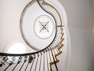
while i’ve been browsing photos i’ve come across some really unique stairwells. whether it’s the railing, the shape or the color, something about these stairwells stood out to me.


image – bhg
i love how this one spirals around and is free from the walls.
image – michael s. smith
the red paint sets this stairway off. it gives the the space so much character.
image – house beautiful
the railing is beautiful on this one. cute pooches too!
image – martha stewart
railing looks vintage. not sure if it is or not.
image – house beautiful
had to throw this one in since i’m in the smoky mountains this week. reminds me of all the log cabins i’ve been seeing.
image – house beautiful
image – traditional home
image – traditional home
image – burnham design

image – willow decor
Cute Girl’s Room
at 17.56 0 comments
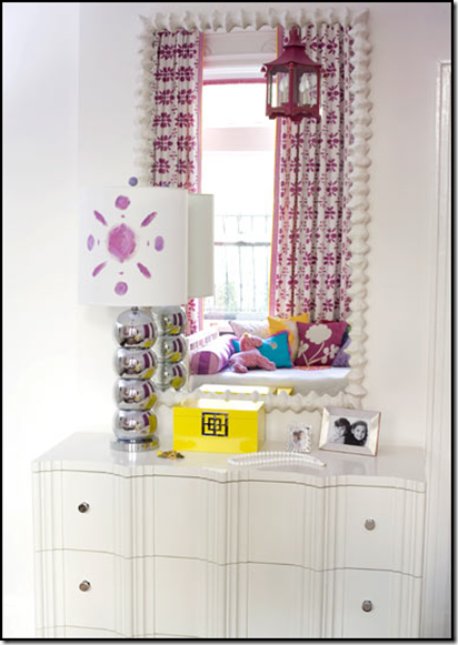
i think this is one of the cutest girl’s rooms i’ve ever seen. it was designed by amanda nisbet of amanda nisbet design. the bright colors she has used are so funky and fun, and i love the yellow accents throughout the room. the hanging lantern light fixture and yellow side table bring the perfect touch of whimsy to the space.

mixing and layering pillows is a great way to bring variety and depth to a room. this daybed is a perfect example of that.


love the wall-to-wall striped carpet. great color and texture.


all images – amanda nisbet design
LiveJournal Tags: cute girl's room,amanda nisbet design
shoe storage
at 17.54 0 comments
what a neat idea for shoe storage! using fabric drapes in front of shelving is a great way to hide you’re storage items. i really like how there is a personalized photo of each shoe on every shoe box. i’d love to have the problem of trying to hide this many great shoes.


images – traditional home
LiveJournal Tags: shoe storage,fabric drapes,traditional home
away from home
at 17.47 0 comments
this week while my dad’s out of town i’m up in tennessee house sitting, dog sitting and watching my grandmother for him. i was a little worried when i got here because i didn’t think i was going to be able to connect to the internet. he must have changed the network key to his router since he wrote it down the last time, but after a trip to staples to purchase a cat5 cable that i can hook directly to the router i’m back in business.
dad’s house is in pigeon forge on a mountain top so i’ve got a great view while i’m here. i wish the trees had started to turn though. there’s nothing prettier than fall in the mountains of east tennessee.
i brought along some great reading materials…the new house beautiful and the new traditional home magazines. they will keep me busy in case i run out of blog to read. i’ve got a few blogs that i have been meaning to do some back reading on and haven’t had time so this will be the perfect opportunity.


i’m bad about flipping through new magazines before i sit down to actually read the articles. i did sneak a peak at the cover story of house beautiful “rooms you’ll never get tired of.” they are right, i don’t think i would get tired of this family room in california designed by michael s. smith. in the magazine this image covers almost 2 pages so you can really see the details well. the chandelier is very charming with the turquoise glass beads around the center. i also like the layered rugs.

i wouldn’t get tired of this kitchen either. it’s from the same california home.

and how inviting is the guest room!

well off to catch up on my favorite blogs. happy monday.
dad’s house is in pigeon forge on a mountain top so i’ve got a great view while i’m here. i wish the trees had started to turn though. there’s nothing prettier than fall in the mountains of east tennessee.
i brought along some great reading materials…the new house beautiful and the new traditional home magazines. they will keep me busy in case i run out of blog to read. i’ve got a few blogs that i have been meaning to do some back reading on and haven’t had time so this will be the perfect opportunity.

i’m bad about flipping through new magazines before i sit down to actually read the articles. i did sneak a peak at the cover story of house beautiful “rooms you’ll never get tired of.” they are right, i don’t think i would get tired of this family room in california designed by michael s. smith. in the magazine this image covers almost 2 pages so you can really see the details well. the chandelier is very charming with the turquoise glass beads around the center. i also like the layered rugs.
i wouldn’t get tired of this kitchen either. it’s from the same california home.
and how inviting is the guest room!
well off to catch up on my favorite blogs. happy monday.
LiveJournal Tags: tennessee,pigeon forge,house beautiful,traditional home,blog,california,michael s. smith,layered rugs
It's LIVE!!
at 17.14 0 commentsMy new website is finally LIVE!
Welcome to the new Cristi Holcombe Interiors, LLC website.
Thanks so much to Matt Vessell from mtvessell Design Studio for all your hard work.
It was so fun to see the branding start coming to life a few months ago with the new business cards that Matt created.
I'm looking forward to posting a few new projects on the portfolio page and on the blog within the next few months. I've been so busy with new projects that I haven't had a chance to actually post about them. I'm looking forward to getting them photographed and on the site.
Please visit the new website when you get a chance and share it with your friends.
Happy 2014!
at 07.05 0 comments2014 is already shaping up to be a great year. In 2 days Elbow Room will premiere on the DIY Network. There will be a block of shows so be sure to tune in on Friday, January 3rd at 3pm. They'll be airing Seasons 1 and 2 while we are hard at work on Season 3. Season 3 is set to premiere on HGTV sometime in late Spring 2014. We've filmed 6 episodes of the 3rd Season and have 7 more to go.
Another great happening in 2014 will be the addition of a sweet little girl in June. I'm expecting another little one. Billy and I are thrilled and can't wait for Chase to have a sister!
In June 2013, I started a rebranding of my company. The rebranding of Cristi Holcombe Interiors, LLC is almost complete and my website should be launching within days. The blog has also gotten a facelift. I'll continue to use Charm Home as my blog and Twitter handle but will use Cristi Holcombe Interiors for the official company business. I'm looking forward to 2014 and hope that you are too!
Here's to a great one! xoxo
Langganan:
Komentar (Atom)


.JPG)


